The Alvarado Project

The Alvarado Project (TAP) is a San Francisco based nonprofit preserving Filipino American history through photography and cultural programming.
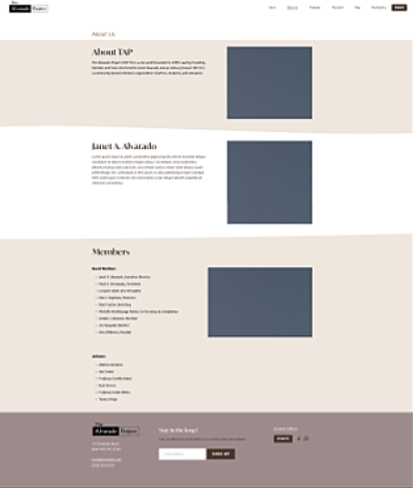
About
Role
UX Designer on a team of two
Timeline
August 2024 - June 2025
Tools
Figma, Adobe Illustrator, Squarespace
While the organization’s work is deeply impactful, its legacy website did not reflect that value. The site was difficult to navigate, unclear in its messaging, and challenging for the internal team to maintain, limiting both user engagement and organizational growth.
The Problem
Broken or inconsistent navigation created friction for users
No clear path for donations or supporter engagement
Content became stale due to maintenance complexity
Messaging lacked clarity, causing confusion about TAP’s role, programs, and offerings
Key UX Challenges
TAP now has a scalable, easy-to-maintain site that clearly communicates its mission, highlights donation, shopping, and supports long-term content growth.
Our Solution
Key UX Decisions & Rationale
-
Separated the nonprofit’s mission and programs from Ricardo Alvarado’s artist narrative to reduce cognitive overload and resolve user confusion between organizational and individual content.
-
Created a streamlined site map with clear paths to explore programs, learn about the artist, and support the organization—helping users quickly orient themselves and take action.
-
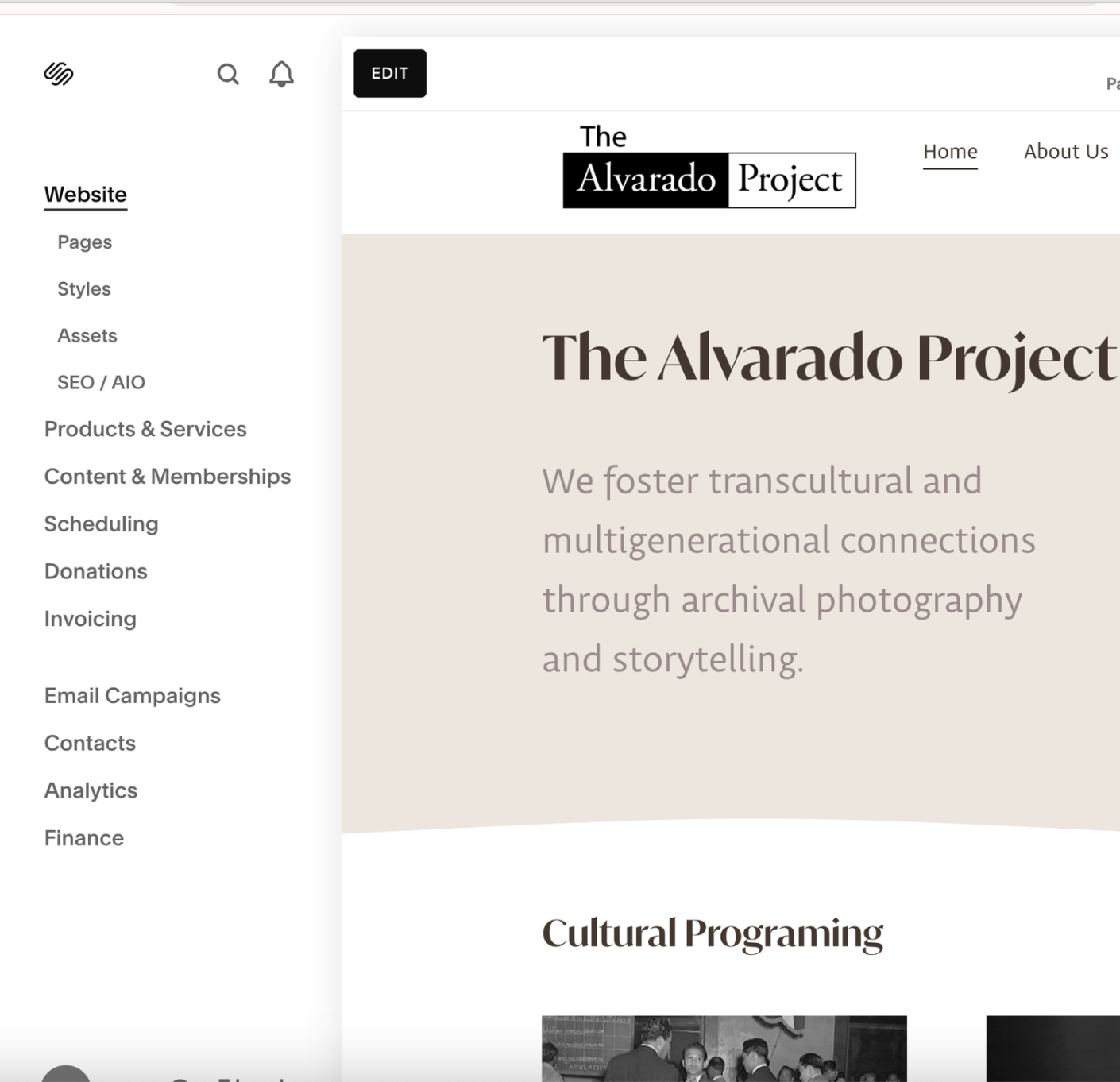
Rebuilt the site in Squarespace to remove technical barriers, allowing staff and volunteers to keep content fresh without relying on developer resources.
-
Elevated the Donate call to action and introduced an online shop for books and merchandise to align the interface with TAP’s primary business goals and supporter intent.
-
Designed fully responsive layouts to ensure seamless access to the archive, donations, and shop across devices, reflecting how users primarily engage with nonprofit content.
Key Interactions
Learn About TAP & The Artist
Established a clear distinction between the nonprofit’s mission and the artist’s legacy to reduce user confusion, strengthen credibility, and guide visitors toward key conversion paths (Programs and Support) rather than exiting the site.
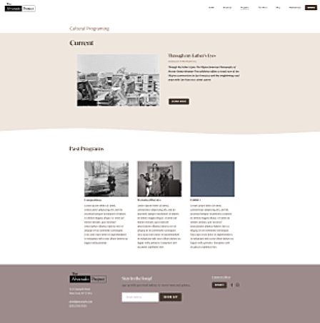
Explore Programming
Designed this section to translate mission into action, using clear previews, dates, and calls to action to direct users to attend events, explore content, or donate, demonstrating TAP’s ongoing impact and sustaining user engagement.
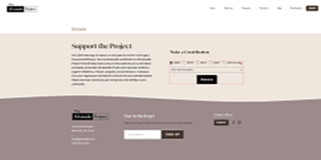
Donate
Implemented a persistent, low-friction donation flow across desktop and mobile to capture high-intent users at peak engagement; predefined giving amounts and streamlined steps reduce friction and minimize abandonment.
Purchase Merchandise
Developed a streamlined, accessible shop experience that offers an alternative contribution path for supporters not ready to donate, while reinforcing the mission through thoughtfully presented books and merchandise.
Research & Discovery
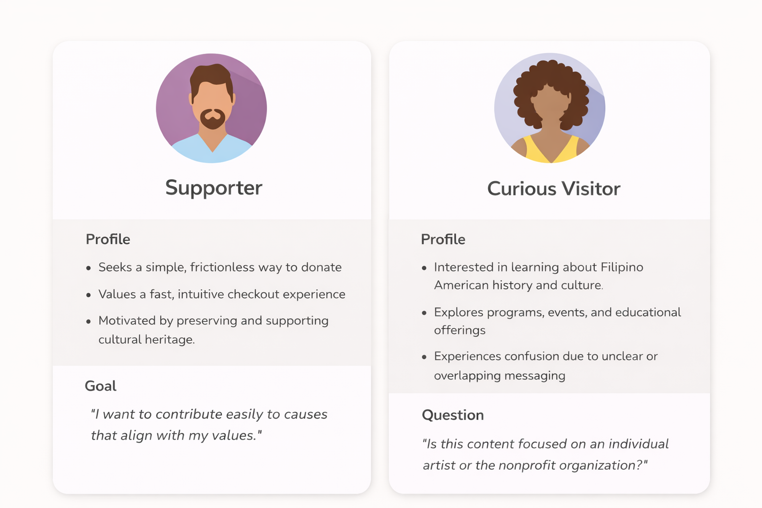
Understanding our Users
Site Audit
Heuristic Evaluation Findings
Navigation — Key pages buried in complex, often mobile-breaking drop-downs
Call-to-Action Visibility — Primary donation button easily overlooked
Information Architecture — Organizational content and program details intermixed, causing confusion
Clarity & Engagement — Visitors struggled to understand TAP’s mission, offerings, and ways to support
Information Architecture & Content Strategy
The Challenge
The legacy site conflated organizational information with the artist’s biography, resulting in unclear messaging, diluted mission focus, and a fragmented user journey.
Our Approach
In collaboration with TAP’s team, we defined two distinct content narratives to create clarity and improve storylines:
1. The Organization — Mission, programs, and community impact
2. The Inspiration — Ricardo Alvarado’s personal story and archival photography
To support this separation, we conducted card sorting and user journey mapping to establish a streamlined, intuitive site structure that aligns with user expectations and reduces cognitive load.
Which resulted in nine clear navigation sections:

Ideation & Process
Wireframe Iterations
We explored two conceptual directions to balance clarity, storytelling, and conversion:
Option A — Simplified structure with strong visual emphasis; however, it risked oversimplifying TAP’s history and reduced visibility of key actions such as Donate
Option B — Richer content and clearer donation pathways; however, it introduced the risk of visual and informational clutter

Low-Fi Option A
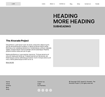

Low-Fi Option B
Final approach
The final high-fidelity wireframes synthesized the strengths of both concepts—maintaining the structural clarity and visual focus of Option A while incorporating the content depth and clear calls to action from Option B.
Hi-Fidelity
Stakeholder Challenges
The Challenge
Balancing the client’s desire to showcase extensive archival content with users’ need for clarity. User testing showed that content density hindered navigation and obscured the organization’s purpose.
Our Approach
Conducted stakeholder alignment sessions to reframe information architecture around supporter and curious visitor goals rather than internal categories, improving clarity, flow, and overall usability while preserving the client’s vision.
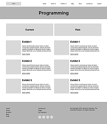
Redesigned the Programs page from confusing categories to a clear, task-based navigation aligned with user goals.
To ensure visual consistency and alignment with TAP’s mission, I established a foundational design system defining color, typography, and core UI components.
Design Systems
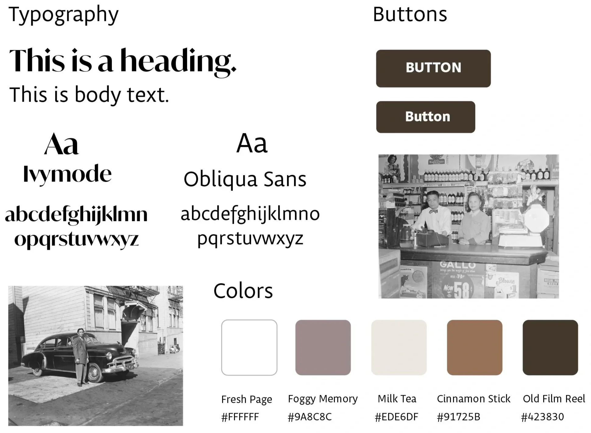
Color palette — Warm neutrals paired with subtle accent tones to complement archival photography and reinforce a sense of community and trust
Typography — Serif headlines combined with sans-serif body text to balance editorial character with modern readability
Calls to action — High-contrast, prominent button styles used consistently for primary actions to improve discoverability and conversion
Handoff
We built the site on Squarespace so TAP’s volunteer team could manage it on their own.
No-Code Build
Reusable components — Modular sections enable efficient addition of new programs, events, and merchandise without developer support.
Training resources — Comprehensive documentation and video walkthroughs to support volunteer-led content management.
Scalable architecture — A flexible structure designed to grow alongside expanding content and community.
Engagement tracking — Built-in analytics to monitor traffic, donation performance, and user behavior over time, supporting data-informed decision-making.
Final Solution
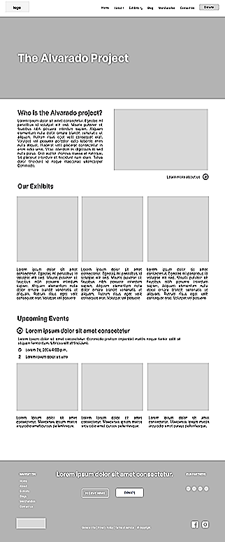
Before & After
Navigation Redesign
Reduced user friction by streamlining the information architecture, elevating key support actions, and aligning the navigation with TAP’s mission—creating a clear, accessible pathway for visitors to engage and take action.
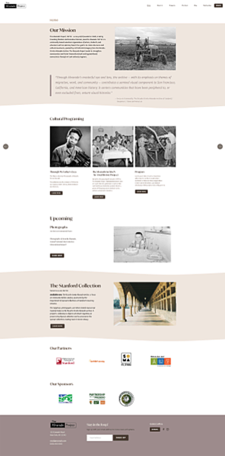
Program Page Redesign
Renamed the Exhibits page to Programs to more accurately reflect TAP’s active initiatives. Refocused the content on current offerings, improving clarity and making it easier for visitors to understand and engage with TAP’s work.
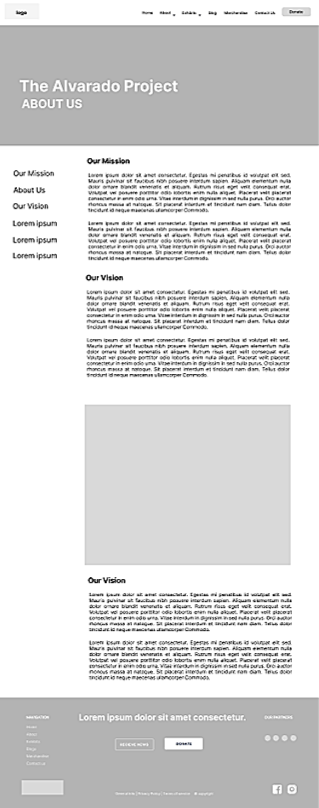
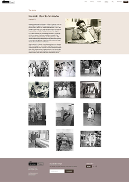
The Artist Page Redesign
Redefined the page structure to clearly distinguish the artist’s legacy from TAP’s active initiatives. By refining content hierarchy and sharpening page purpose, the redesign improves clarity, strengthens narrative focus, and enables visitors to better understand both the artist’s impact and TAP’s ongoing work.
Action-oriented Footer
Designed a clean, streamlined footer with prominent calls-to-action—including Social Media, Donate, and Newsletter sign-up—to drive engagement. Removed redundant links and excess content to enhance clarity, accessibility, and overall usability
Key Takeaways
Reflections
This project extended beyond resolving usability issues; it focused on empowering a grassroots nonprofit with the clarity and structure needed to communicate its mission confidently. By clearly distinguishing TAP’s organizational mission from the artist’s legacy, simplifying navigation, and elevating high-priority actions such as Donate and Shop, the redesign more effectively supports outreach and fundraising objectives.
The engagement underscored how intentional information architecture and accessible design directly impact how small organizations connect with their communities. Strategic decisions, such as renaming “Exhibits” to “Programs” and restructuring the footer, were not merely visual refinements, but structural improvements that clarified the organization’s value proposition and strengthened long-term sustainability.
This work reinforces my approach as a UX designer, building scalable systems that reduce friction, elevate storytelling, and enable mission-driven organizations to grow through intuitive, seamless experiences.
Impact
The outcome is a clear, accessible, and sustainable digital platform. By separating the nonprofit’s mission from the artist’s legacy, prioritizing key conversion pathways (Donate and Shop), and implementing a no-code, self-managed system, we delivered a solution that the team can confidently maintain. The result empowers TAP to amplify its story, increase engagement, and focus more fully on serving its community.