Stanford Giving Page
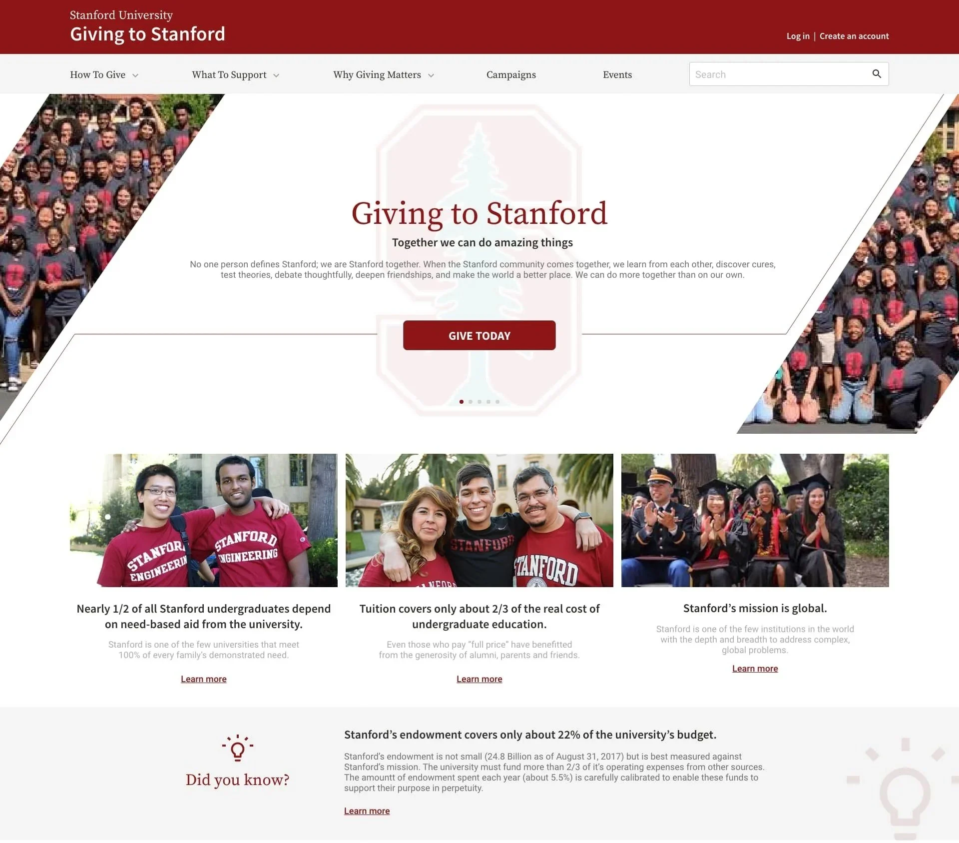
Stanford University has one of the largest financial endowments in the world and brings in millions in gifts from alumni every year. However, this is not enough as these funds are meant to be used in perpetuity and a lot of these funds are restricted or earmarked for specific purposes. As a result, Stanford still needs to fundraise and collect gifts from as many sources as possible.
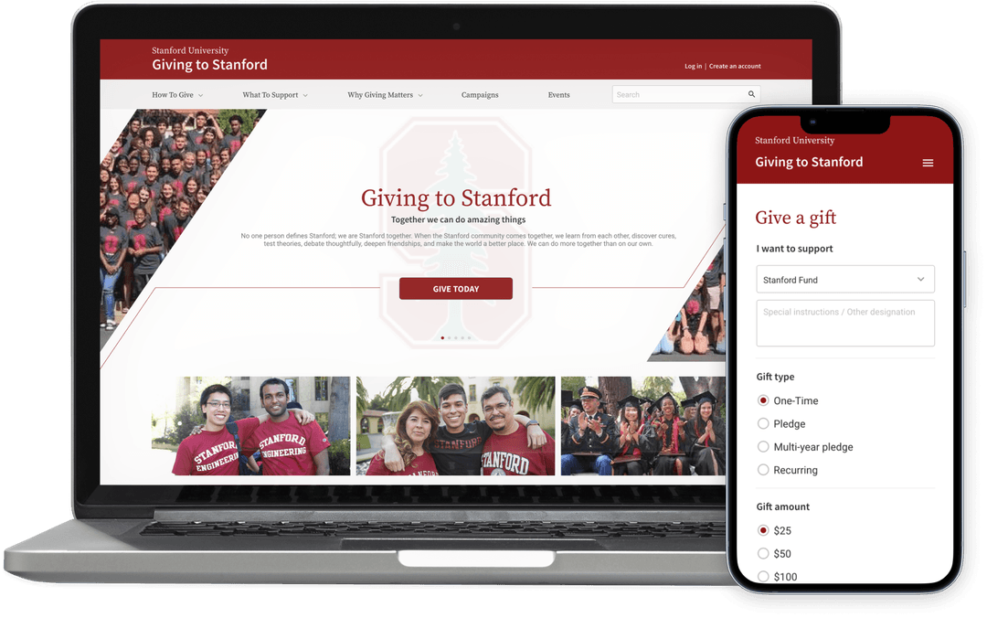
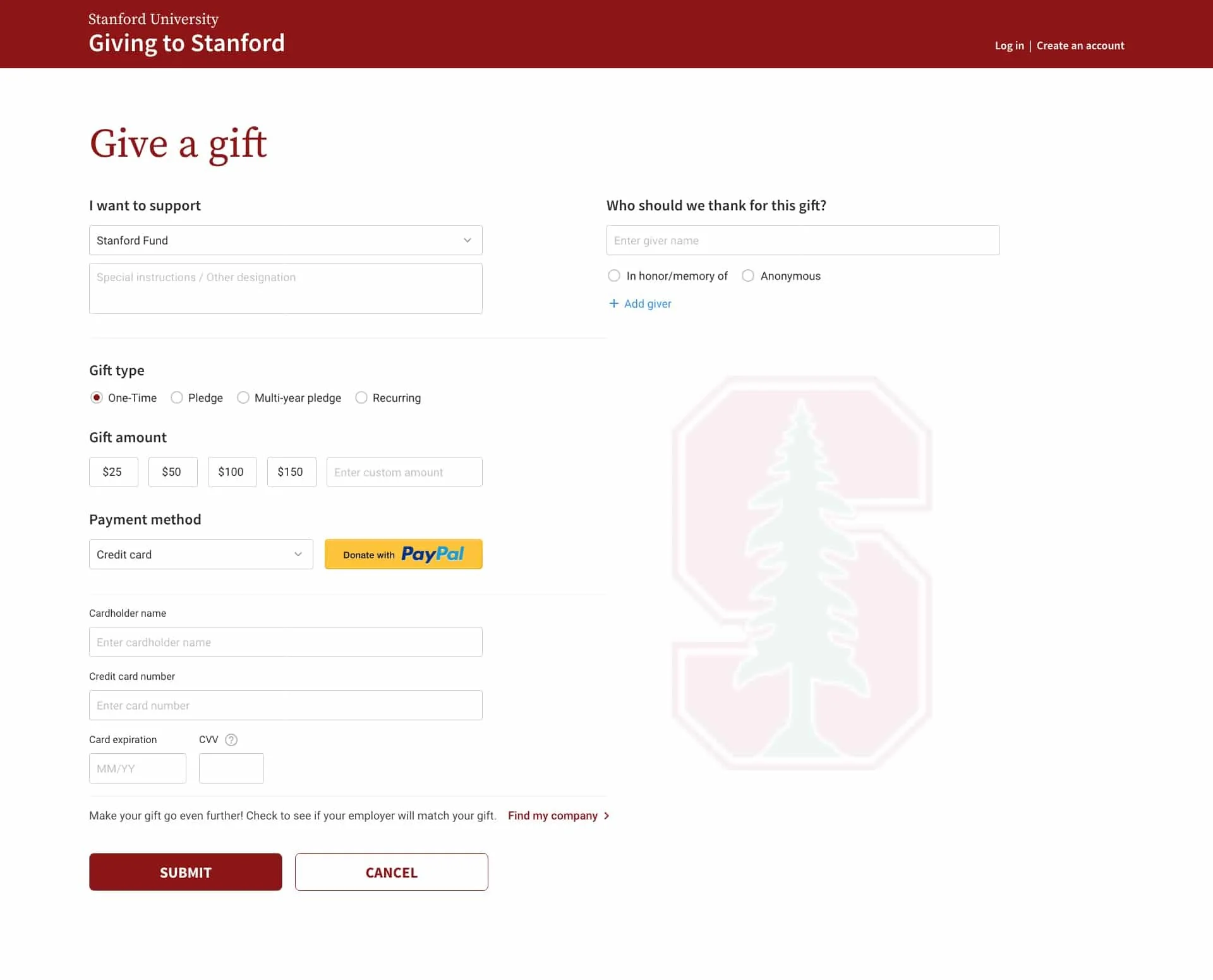
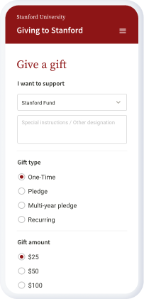
My team was given the opportunity to help Stanford improve the journey of their online Giving experience. This included providing designed solutions to help their Giving landing page and their Giving online payment form attract more gifts for the university.
About
Role
Lead UX Researcher + two designers
Duration
4 Week Design Sprint
Tools
Adobe Illustrator, XD, Usertesting.com, Exel

Site Audit
We began by trying to get a better understanding of the current giving page and form. We wanted to ask the important questions to determine what was currently working and where improvements needed to be made.
How easy (or difficult) is it to navigate through the website?
Is the giving form clear and straight forward, or would users be confused?
Is content where a new user would expect it to be?
These were some of the questions that we asked ourselves during the initial evaluation of the giving website and giving form.
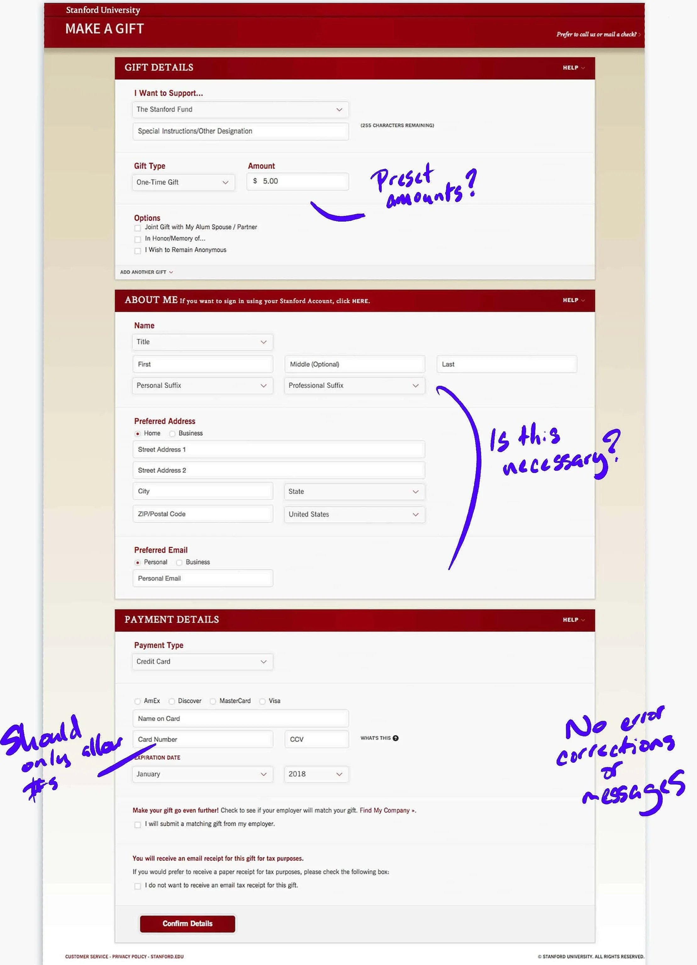

Heuristic Evaluation Findings:
Inconsistency on where to find the call to action button to be redirected to the giving landing page.
Ability to enter incorrect characters in fields that are exclusively for numeric characters (zip codes, etc.)
Seemingly unnecessary information fields.
No error management system if incorrect information is submitted
Research
For competitive analysis I reviewed the other giving sites of direct competitors such as Columbia University, Harvard University, and Massachusetts Institute of Technology (MIT).
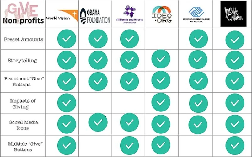
For comparative analysis I reviewed other giving sites of indirect competitors such as Ideo.org, Boys & Girls Club of America, and Invisible Children.
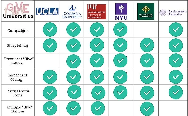
Competitive analysis
Comparative analysis
Wireframes
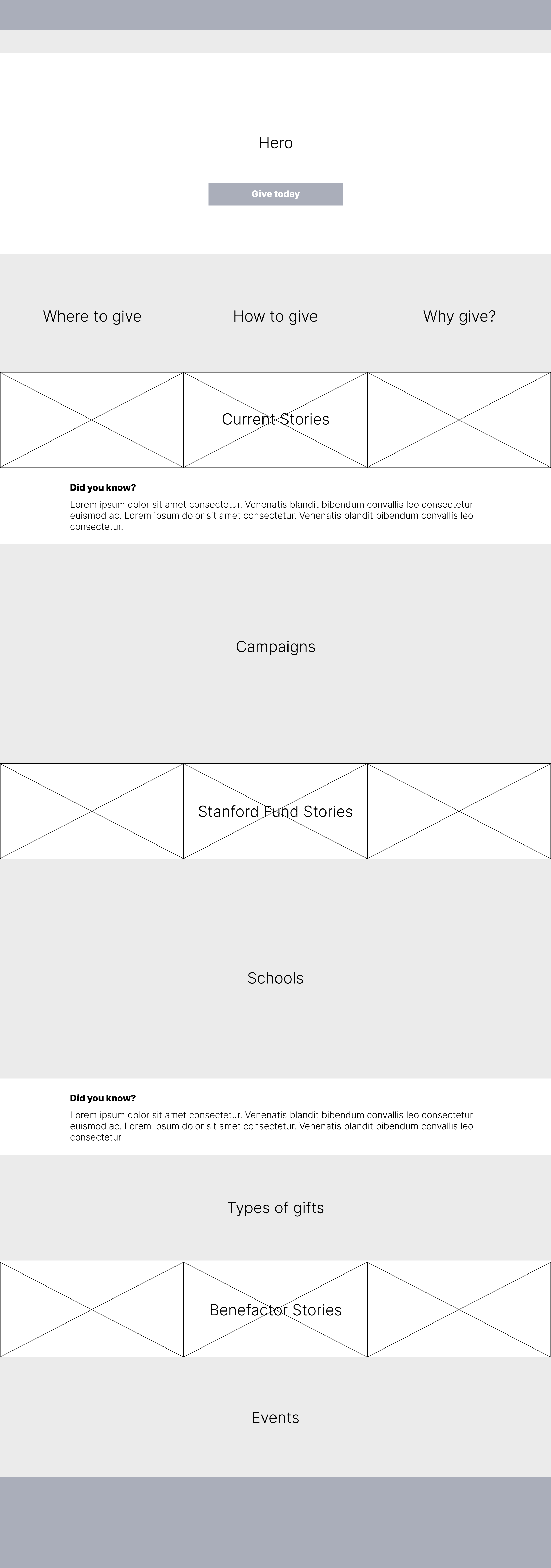
Lo-Fidelity
Prototypes

Hi-Fidelity
Usability Testing
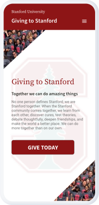
In order to get some feedback from our university contact, we created some mockups of the new designs in Adobe XD to share in our next meeting.
We cleaned up some of the heuristic issues on the giving form as well and pushed all of the extraneous data that the university wanted to collect towards the end of the workflow. We also suggested that the university add the convenience of a quick pay option, as it was mentioned several times in testing sessions.


Final Solution